Project 4- Tete a Tete
April 21, 2009
Type & Image.
April 20, 2009
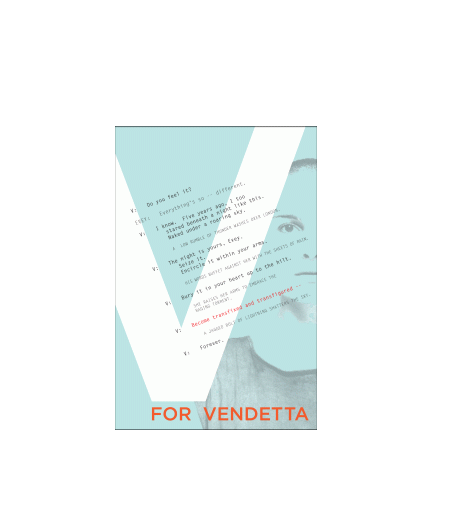
I strove to attach my emotions about the movie into a visual for the poster. I decided to use one image to create emphasis without overpowering the intensity of the screenplay excerpt. The large, white V stands in front of Evie’s face in order to draw more attention to text than image. I chose to highlight “Become transfixed and transfigured…” as it pertains directly to Evie’s facial expression. I created rhythm in the screenplay by varying the type style (bold, italic, regular). “For Vendetta” ties to the rest of the composition by its use of color, connecting to the highlighted text above. There is a sense of movement as the eye shifts from the directional paths of the text and the weight of the “V”.
Columnar Grid.
April 20, 2009
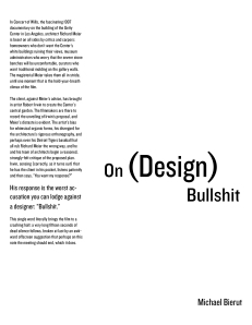
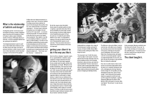
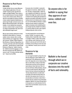
For this assignment, I chose a three column grid in which to organize a a 4 page spread of “On Design Bullshit” by Michael Bierut and responses. The headline contrasts the font text because it acts more as an image. I worked to incorporate image with text in a way to balance the positive and negative space. This creates rhythm by the negative space around the edges of the text blocks. This also sets the images to define the margins of the page. I created rhythm with the use of pullout text (large and bold contrasting to the small regular typeface).
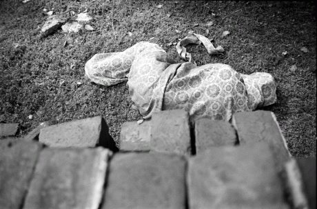
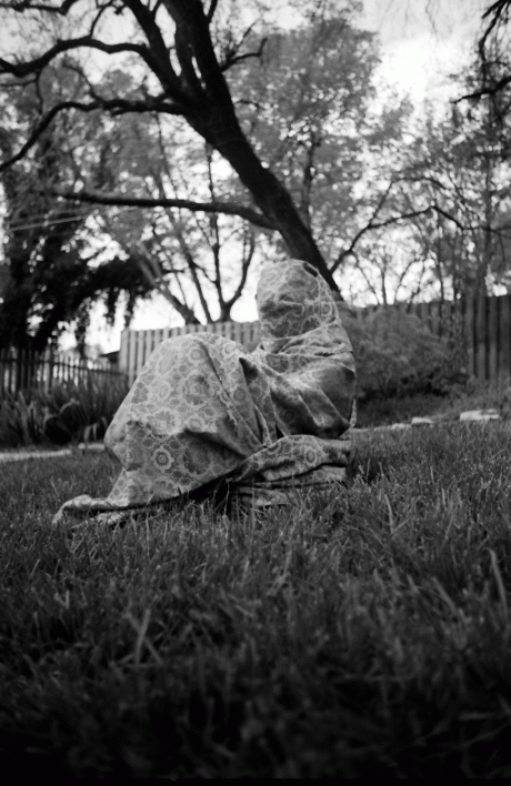
Project 5- Final
April 17, 2009
Letter Spacing.
April 15, 2009
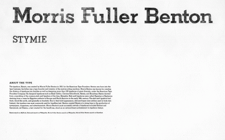
For this project, I used the typeface, Stymie. and worked on letter spacing by hand. The typeface name and designer are hand spaced and traced. The spacing between letters is carefully considered, adjusting to serifs and the bold headline type of text. Each letter is spaced according to the letter spacing preceding. Below the traced text is a typed paragraph regarding the designer, Morris Fuller Benton.
Micro + Macro Readings
March 30, 2009
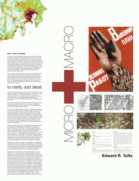
This project deals with the organization of text and image in modules placed on a grid. I worked with creating a title that worked more as an image to create contrast on the page. I played with scale of the images, exploring the balance of micro and macro. The text fit into one column which allows for an easy read. The only exception is the pull out of the words “to clarify, add detail.” This quote clearly conveys Tufte’s points in his readings. I feel that the organized and tight spacing of the images works well with the balance of negative white space. The use of varied texture by the weight of the text adds contrast and balance to the piece as well.
Type & Image: Research
March 30, 2009
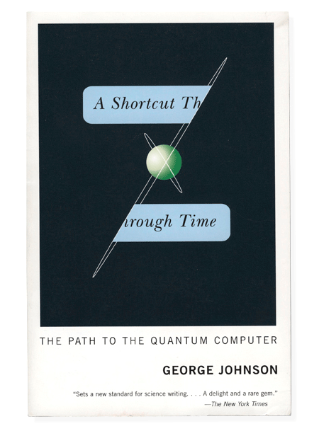
This book cover design by Scott Hansen deals with a complimenting text and image relationship. He has created a “shortcut” as the title jumps from one side of the planet’s orbit to the other. It is a simple but captivating cover as the reader is engaged by leading the viewer’s eye down the cover in order to read the entire title.
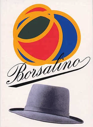
 This poster design by Max Huber reveals a teeter totter relationship as the title balances between the two images above and below. It seems to be having an effect on each image which creates movement in the piece. The movement effects the viewer as the awkward tension between type and image engages the viewer’s eye. The type is also flowy and playful which plays with the curved forms of the images.
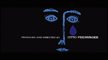
This clip from a movie featuring type and image designed by Saul Bass has a unified relationship between text and image. The horizontal text is divided and complimented by the vertical image. The image has weight on the right side as there is more texture and more form which compliments the change of type on the right side. The type on the right is larger and has more emphasis with the relationship of the giant tear drop weighing over it.
Project 3- Observation & Construction.
March 30, 2009
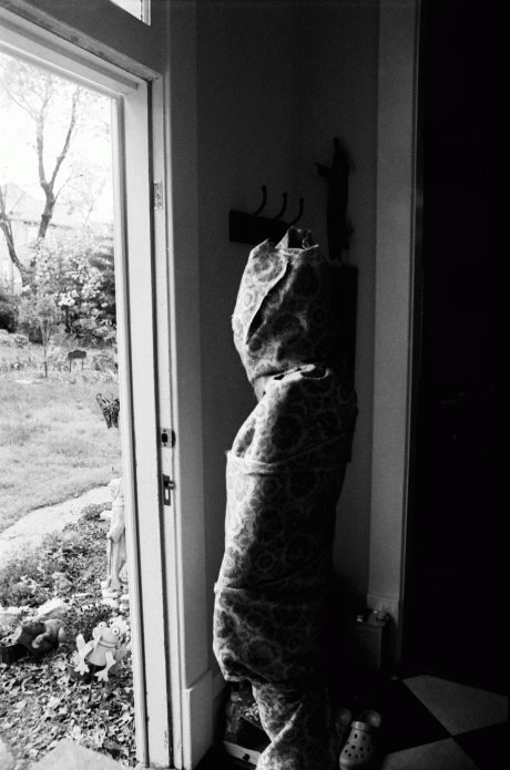
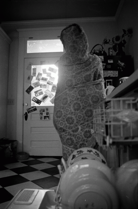
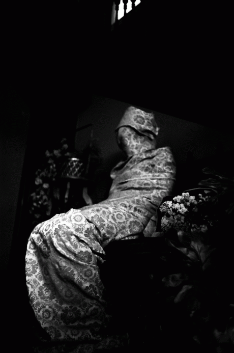
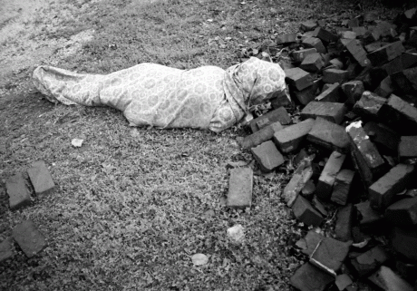
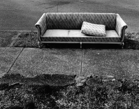
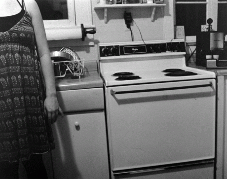
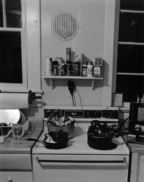
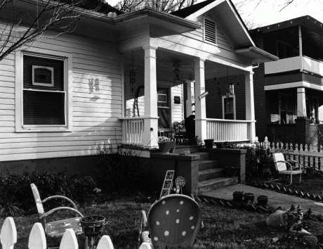
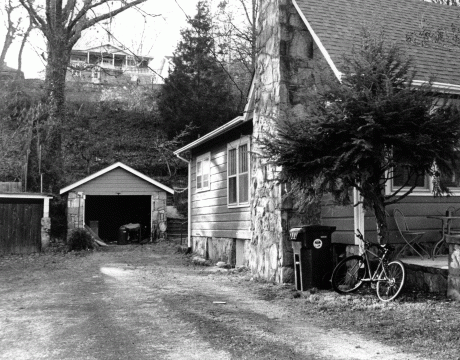
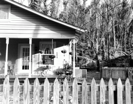
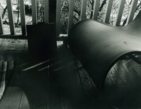
For this project, we dealt with the use of an observed space versus a constructed space. The two constructed spaces are the images in the kitchen (the second and third photographs). With the images of the houses, I wanted to convey a sense of presence by the decorative porches and characteristic yards, but with the absence of the people who constructed them. The photographs in the kitchen refer to a change of time and the act of the woman in the kitchen. She seems to be labeling her self in the first photograph as belonging to the space. The second photograph is her rebellious act against the state she was previously in as an image of boiling ties in pots appears on the stove.
Project 2-Histories of Things.
March 4, 2009
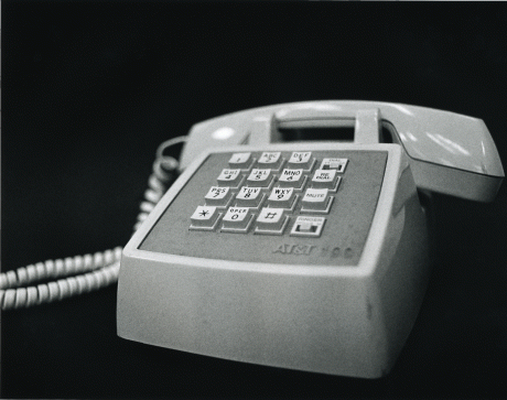
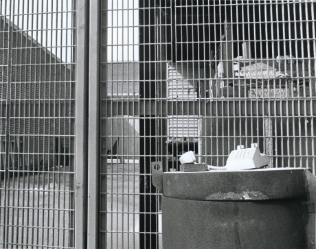
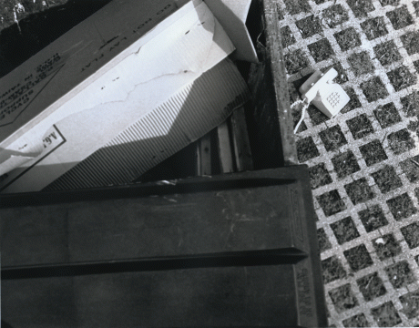
The following six photographs derived from a project in which we documented two objects among a plain background and a conceptual background. I chose my found object in America’s Thrift Store, a discarded AT&T 100 touchtone telephone. I wanted to key in on the disconnected society of today. Cellphones, unfortunately, allow its users to do many things at once while talking on the phone. For example, people drive and talk on the phone. These cell phone conversations hold no value with life’s many distractions. It is as though we need this cord to tie us down and keep us connected to each other. In both conceptual backgrounds, I focused on placing the telephone within a grid in which the phone becomes an integral part of these connected lines.
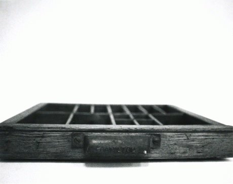
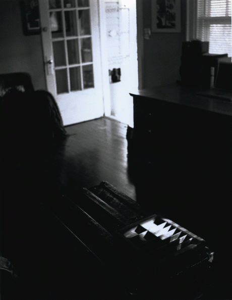
For my personal property, I chose a Hamilton lettering wooden desk drawer. This object possesses the documentation of the drastic change in lettering and the discarded use of physically created documents. I wanted to remember the process. In one conceptual background, I set the drawer within a spot of light among darkness, the other dark among light. These represent the lost and found. the use and non-use of this drawer. The image in which the drawer is set in shadow, reveals a line of garbage bags behind a barred wall. The drawer is suggestively sinking into the shadows by moving toward the background (the trash) as the natural process of documentation is almost nonexistent. In the other conceptual photograph, the drawer sits on an old wooden trunk in a spot of light and in the background an open door reveals a beam of natural light. The drawer is being idolized as a positive view of the natural documentation in the past.
Hierarchy Composition.
February 23, 2009
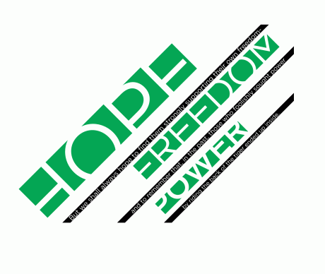
My inspiration for this project is an excerpt from John F. Kennedy’s inaugural address dated January 20, 1961: “But we shall always hope to find them strongly supporting their own freedom- and to remember that, in the past, those who foolishly sought power by riding the back of the tiger ended up inside.” I wanted to visually convey the layered information: learning from the past and building on the present. I chose to layer the information like layers of the earth and therefore, used green in the composition as a highlighter to these inspirational words: “hope”, “freedom”, and “power”. Although I wanted to demonstrate the layering of information, I also wanted a sense of unity by incorporating the whole quote in the composition in a clear and organized manner. I separated the text into three sections in between the layers of “hope”, “freedom”, and “power”. The words are contained in a black box, extending past the edge of the composition, which emphasizes their unmistakable and lasting presence. They are solidly embedded between the broken layers of the earth. I chose to crop off the sections of the words “hope”, “freedom”, and “power” to emphasize their frailty. These words are powerful (visually large in scale), yet easily broken and poorly construed in history (visually disconnected pieces or plates), but among (a complete quote) a document of history.
